As a Sofer I have spent countless hours looking at letters and also studying different concepts and ideas brought down in Chazal in the field of Safrut. By definition a Sofer is a copyist, and my job is do write my Torah Scroll as uniformally and perfectly as possible, without much room for creative work.
When I started in Safrut, I even considered adopting the obsolete Mesora of Otiot Meshunot for my personal Torah, as these letters are a great medium for creative and artistic work. I quickly realized it was a bad idea, as the mesorah of these odd letters is lost and not in use, so how could I write a scroll with a lost mesora? The whole point of a Torah Scroll is adhering to the accepted mesora of our day, and that's what I did in the end.
I'm exploring my creative urge in Safrut in a different way. I developted a design concept that is rooted in a sofer's work and also in many commentaries in the Torah - the concept of the interplay between Black Fire (written letters of the Torah) and White Fire (invisble letters that surround the written letters).
According to tradition, the white letters will be revaled in the future, and we can only ponder what they actually are. It's hard to visualize how these invisible letters will actually appear in the Torah Scroll, as our scrolls today are so simple and unidimensional. But the invisible letters are there, and it is said in the name of the Arizal that while all Jews have a corresponding letter in the Torah, this personal letter might be actually not a written letter but an invisible one located in the blank klaf (by the way, this is way many have the minhag of looking at the Torah Scroll at the time of Hagba in shul, as the Ari said that you might evetuallt peek at your letter and connect to it).
My design is an attempt to crystalize this interplay between visible and invisble letters, and I got inspired when writing my recent post on the Four Legged Shin of the Tefillin. This odd letter is precisely one of the invisible letters which surround a normative written Shin, and it got me thinking how each letter from the Hebrew alphabet can relate to others. The most obvious combination is the famous Peh-Bet interplay, which scribes always make sure to create whenever writing a Peh in the Torah (with a small inner Bet). But there are many other possibilities, for example, a Yud inside a Kuf and so on.
My first design variation is called Black and Color Fire, which is the best way to visualize how a black letters might be surrounded by many other invisible letters (represented by the colored letters) at any given time.
Then you have the fully colored design, called Color Fire, which is more uniform and perhaps more pleasing to the eye.
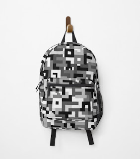
Lastly, I made a B&W version called Black and White Fire, which was the hardest but surely my favorite. It was a challenge to form the letters using only grayscale colors, because it's harder to spot the different letters around the canvas. It brings me back to the black and white scheme of the Torah Scroll, which is the pallete I always face when writing.
These designs are available for everyday items, as there's no reason why we should not be constantly reminded of the sanctity of the Hebrew letters and their relevance to our daily lives. While a Torah Scroll is mostly kept safe out of eyesight, my design is made with our modern world in mind and with the intention of bringing scribal ideas out in the wild. You have shabbos mugs, backpacks, phone cases and pillows. Soon you will be able to buy Mezuzot as well. It's more traditional then my wacky Banana art Mezuzah, which was really my first attempt at creating a Judaica piece.
This is my Judaica collection, Lavlor Judaica.


